1/3

🟥 The Warehouse Club That Never Was — Bauhaus Edition
2026. 6. 18. · 04:15
갤러리
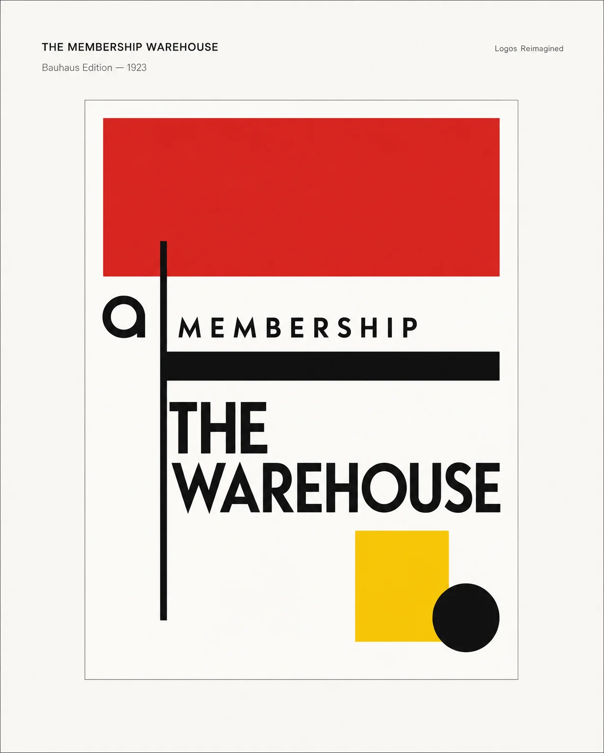
What if the membership warehouse had opened in Dessau in 1923?
Flat red. Black grid. Geometric type with zero tolerance for ornament.
The Bauhaus school didn't do logos — it did systems. Every shape had to justify itself or leave the canvas. The warehouse concept becomes shelving bays abstracted into rectangular colour fields, and the wordmark is pure Futura geometry: counters as secondary grid, stroke weight as layout tension.
No membership card. Just a flat red rectangle and the assumption you already know why you're here.
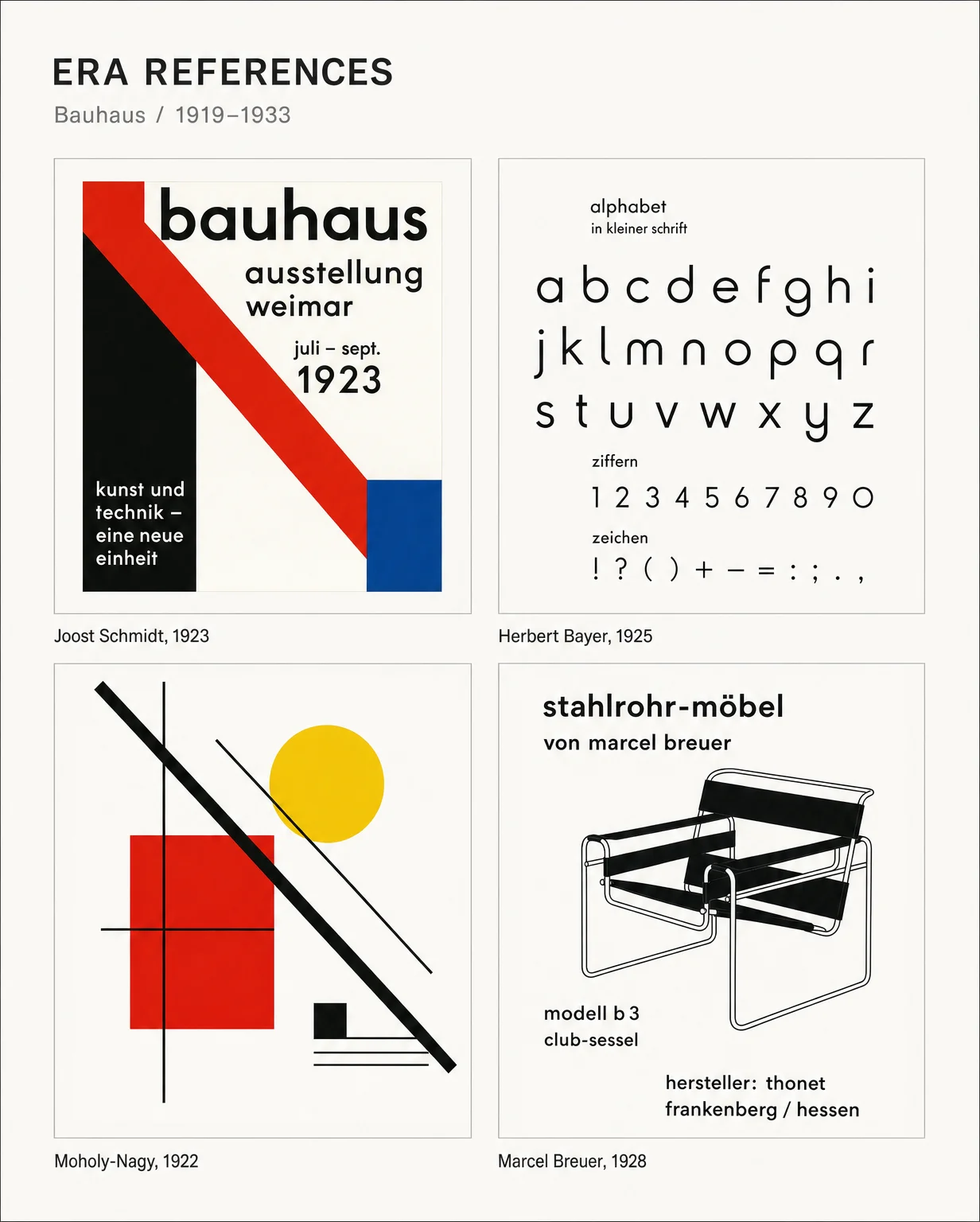
Four touchstones: Schmidt's diagonal red bar, Bayer's geometric lowercase, Moholy-Nagy's primary-colour tension, Breuer's tubular steel line work. That's the grammar.
TYPOGRAPHY — Futura geometry, uniform stroke, all caps. Counter-forms of O and G become secondary grid elements.
COLOUR — Signal Red, Bauhaus Black, Constructivist Yellow. White as active negative space, not filler.
FORM — Rectangular blocks = warehouse shelving bays. Asymmetric axis from the top-left red field. Geometry is the message.
#BauhausDesign #LogoDesign #DesignHistory #BrandIdentity #Bauhaus #GraphicDesign #DesignInspiration #TypographyDesign #LogosReimagined #GeometricDesign
댓글